
A good visualization helps you see what
the data is telling you. The best visualizations help you you see things
you never thought the data would tell you. These 22 charts and maps
were, at least for me, in that category: all of them told me something I
found surprising. Some of them genuinely changed the way I think about
the world.
-
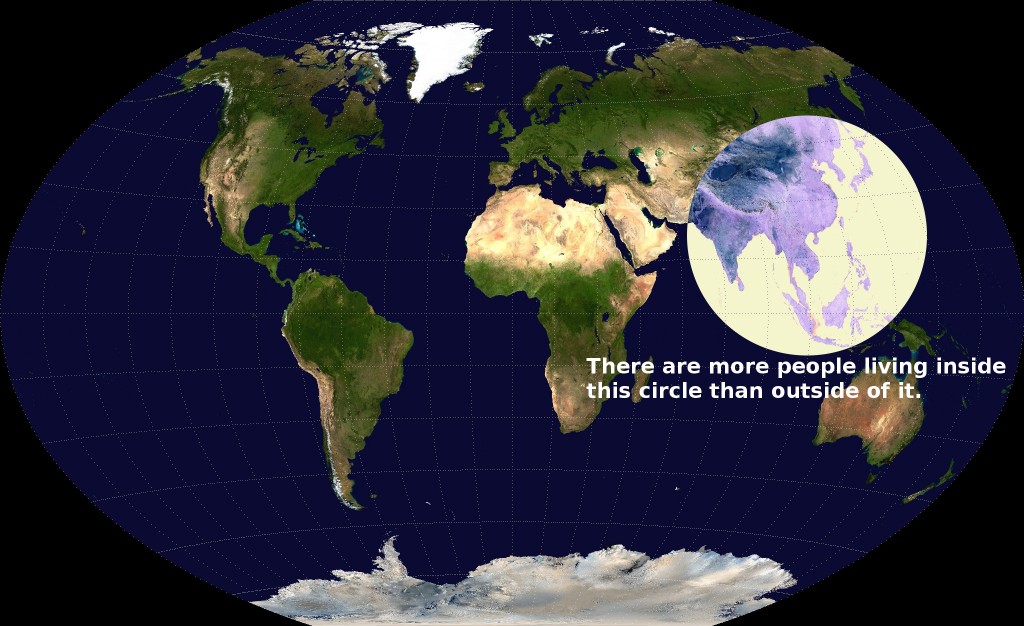
This map can be summed up quite simply: a ton of people live in Asia. That circle encompasses China, India, Indonesia, Bangladesh, Japan, Vietnam, the Philippines, Burma, Thailand, South Korea, Nepal, Malaysia, North Korea, Taiwan, Sri Lanka, Cambodia, Laos, Mongolia and Bhutan. Caitlin Dewey checked the math, and found that, yes, a bit more than 51 percent of the world’s population lives in those countries. "I’m glad I’ve moved to these parts," wrote Reddit user Valeriepieris, who posted the map. "All you guys outside the circle are just playing a sidegame."
-
In the book "All The Countries We’ve Ever Invaded", British historian Stuart Laycock writes that "out of 193 countries that are currently UN member states, [the British] invaded or fought conflicts in the territory of 171. That's not far off a massive, jaw-dropping 90 per cent." But a lot of those incursions are relatively obscure. For instance, the time British troops took the Ionian islands doesn’t make it into many non-Ionian history books. Laycock’s methodology is broad — he includes British pirates, privateers, and armed explorers whose activities were blessed by the government — and his research goes all the way back to the beginning. In a review, the Telegraph notes that "the earliest invasion launched from these islands was an incursion into Gaul – now France – at the end of the second century. Clodius Albinus led an army, thought to include many Britons, across the Channel in an attempt to seize the imperial throne. The force was defeated in 197 at Lyon."
-
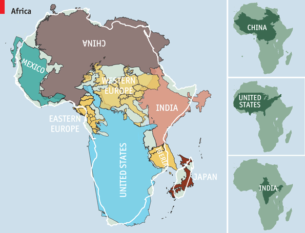
Africa is much bigger than you think
Most maps you see are based on the "Mercator projection," so named for Gerardus Mercator, who came up with it in 1559. The Mercator projection is excellent for sailing, as it shows constant bearing as a straight line. But it’s terrible for estimating the size of large masses of land — particularly when they’re close to poles. Under the Mercator projection, for instance, Africa looks to be about the same size as Greenland; it’s actually 14 times larger. The Economist — building on work by Kai Krause — made this graphic showing Africa’s true size: bigger not just than Greenland, but than China, the United States, India and Western Europe put together.
-
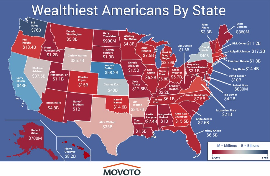
The wealthiest American in every state
The geography of wealth inequality doesn’t get much attention. But it’s stark. There are about 450 billionaires with American citizenship — and almost 200 of them live in New York and California. The result is this map. In some states, the richest people are well-known names, like Bill Gates or Sheldon Adelson. But how many of you know Leslie Wexler, CEO of the L Brands corporation and, with $5.7 billion, the richest man in Ohio? How about Anne Cox Chambers, who holds a controlling interest in Cox Enterprises and, with an estimated net worth of $15.5 billion, is the richest person in Atlanta?
-
Switzerland is the best place to be born
The Economist’s Intelligence Unit tried to assess which country gave its children the best chance of a happy, safe and prosperous life. "Being rich helps more than anything else," they write, "but it is not all that counts; things like crime, trust in public institutions and the health of family life matter too." The final measure factors in everything from income to geography to demography. When all is said and done, Switzerland leads the list, with Australia and Norway close behind. The United States tied with Germany for 16th place.
-
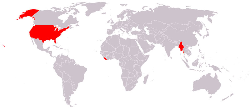
Liberia, Myanmar, and the United States are the only countries that don't use the metric system
As Vox’s Susannah Locke wrote, "The measuring system that the United States uses right now isn’t really a system at all. It’s a hodgepodge of various units that often seem to have no logical relationship to one another — units collected throughout our history here and there, bit by bit. Twelve inches in a foot, three feet in a yard, 1,760 yards in a mile." That’s why the rest of the world uses the metric system, where "all you need to do is multiply or divide by some factor of ten. 10 millimeters in a centimeter, 100 centimeters in a meter, 1,000 meters in a kilometer. Water freezes at 0°C and boils at 100°C."
-
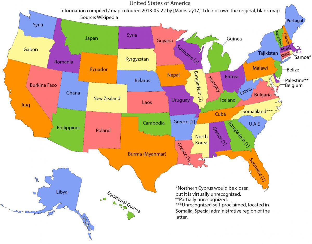
America is so big that its states are the size of countries
This map puts the sheer size of the United States into perspective. Montana is about the size of Japan. California is roughly as large as Iraq. Arizona is as large as the Philippines. Though, to be honest, I find this map surprising because some countries are much larger than I’d realized. I wouldn’t have guessed, for instance, that Burma is as large as Texas, or that New Zealand is the size of Colorado.
-
Much of America in uninhabited
This map, by Nik Freeman, pulls out the 4,871,270 census blocks — covering 4.6 million square kilometers — where no one lives. That tends to mean one of three things: the first is that the land is uninhabitable, perhaps because it’s covered by a lake. The second is that laws or other kinds of sanctions prevent settlement, for instance on national parks. The third is that it’s a commercial or industrial zone where people work, but no one actually lives. "Human geographers spend so much time thinking about where people are," Freeman writes. "I thought I might bring some new insight by showing where they are not."
-
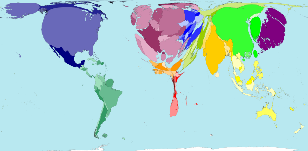
The map of world wealth
This is a map of the world weighted not by land mass or navigation lines but around how much wealth each country has. As you can see, North America and Western Europe balloon to enormous proportions — even after adjusting for purchasing power, 46 percent of global wealth in 2002 was in their hands. The horror of this map is the shrunken husk of Africa. That’s a lot of people living with very little.
-
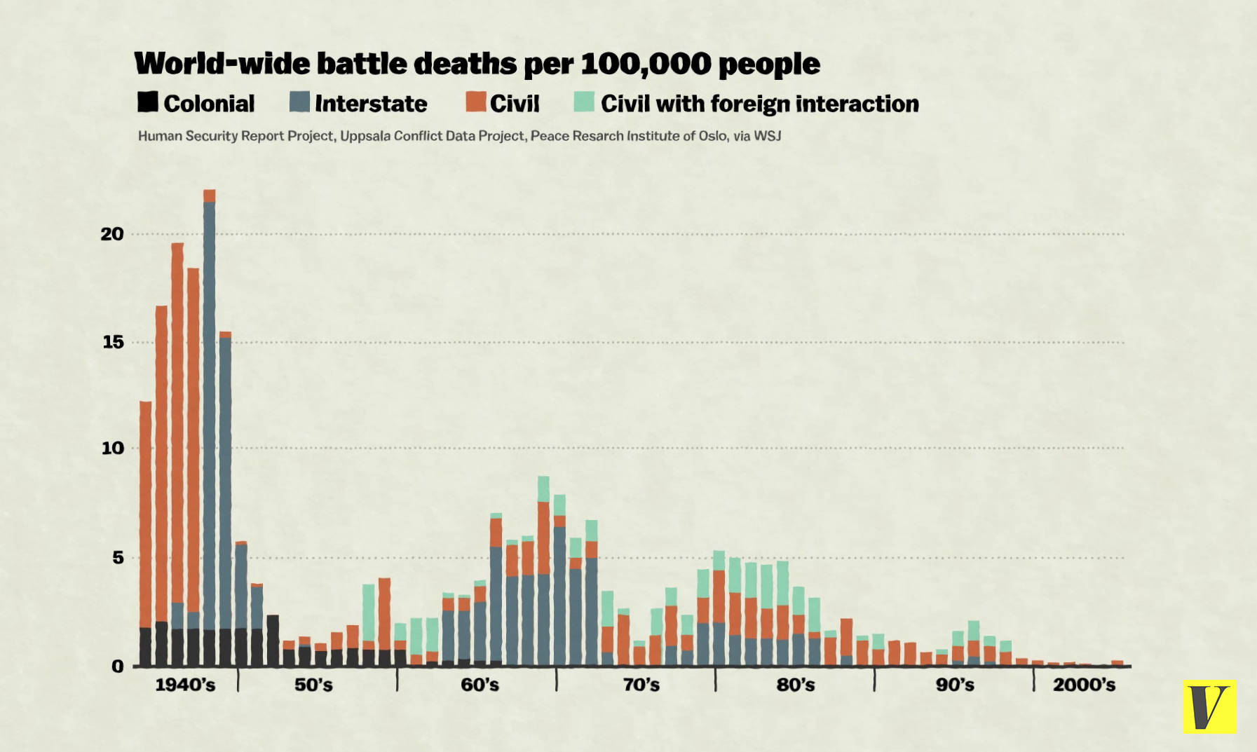
Fewer people are dying from war than ever before
People sometimes complain that the press never writes about all the planes that land safely. By the same token, it also doesn’t write about all the people who aren’t dying in wars. But the decline in war-related deaths is a huge story — one of the most encouraging of the 20th Century, for sure. "On average, about 15 percent of people in prestate eras died violently, compared to about 3 percent of the citizens of the earliest states," wrote Harvard’s Steven Pinker. "The rate of documented direct deaths from political violence (war, terrorism, genocide and warlord militias) in the past decade is an unprecedented few hundredths of a percentage point." Vox’s Zack Beauchamp explains the reasons for the decline here, and it includes some culprits you probably don’t expect, like nuclear weapons.
-
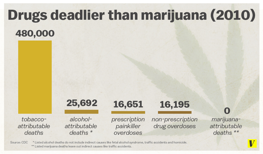
The most dangerous drugs in America are perfectly legal
As German Lopez writes, "there’s one aspect of the war on drugs that remains perplexingly contradictory: some of the most dangerous drugs in the US are perfectly legal." This chart uses data from the Centers for Disease Control and Prevention to make a counterintuitive point: the deadliest drugs in America are legal. In some cases, those drugs are deadlier because their legal status makes them more widely available. If heroin were as easy to get as tobacco, more people would surely die from it each year. But that’s not true in all cases. Alcohol is much more dangerous than marijuana, but marijuana is illegal in most states, while alcohol is legal for those over age 21.
Reposted from Vox.com

No comments:
Post a Comment