-
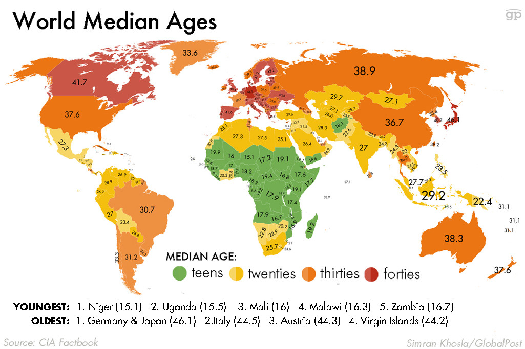
Germany and Japan have the world's oldest populations. Niger has the youngest.
Much of what looks like politics and economics is actually just demographics in disguise. Country’s with aging populations often end up with high budget deficits and weak economic growth because there are too few workers to support the many retirees. Countries with extremely young populations often end up in political chaos — particularly if there aren’t enough jobs to go around. Right now, Germany and Japan have the world’s oldest populations, with a median age of 46.1. Niger has the world’s youngest population with a median age of, shockingly, 15.1.
-
Snapchat is more popular than Twitter among Millenials
According to data collected by Comscore and compiled by Statista, more millennials have installed Snapchat on their phones than Twitter. And Instagram is more popular than either of them. This data doesn’t tell us much about how often the different services are used, but it does speak to the incredible popularity of picture-based messaging apps among young people. Next time you hear about Snapchat seeing a $10 billion valuation, this chart is why.
-
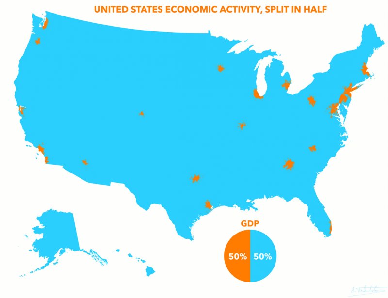
Half of US GDP comes from these 23 orange blotches
Half of America’s gross domestic product comes from the 23 orange blotches on this map. The other half comes from the vast acres of blue. Those orange blotches are America’s largest metro areas — and they absolutely power the American economy. But though small in size, they’re large in population: about 110 million people live in those orange blotches, says Reddit user Atrubetskoy, who created the map. So what you’re seeing on this map isn’t just that there’s a lot of economic activity compressed into some very small spaces in America, but that there are huge swaths of the American landscape where not that many people live.
-
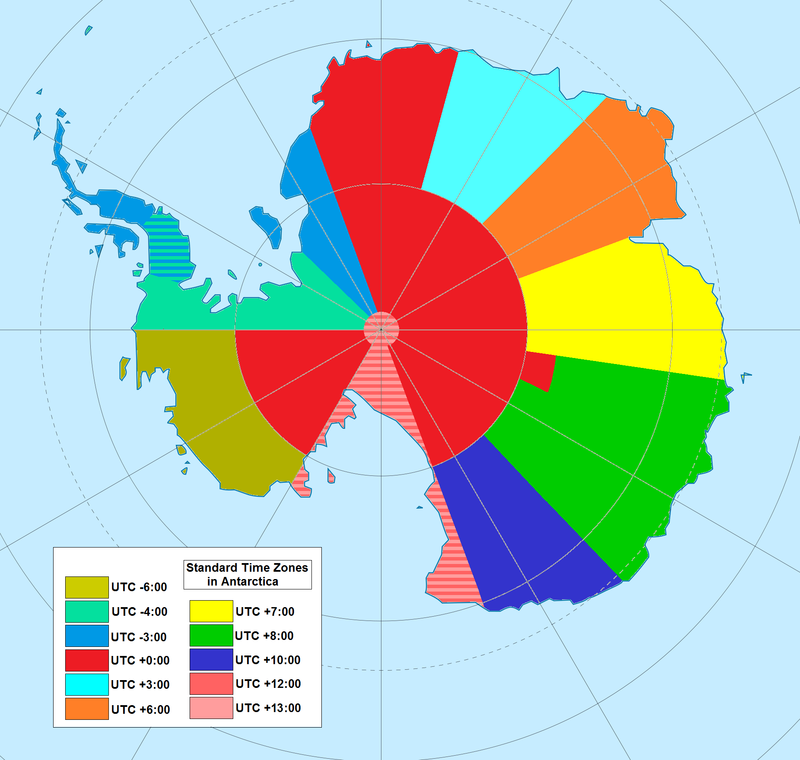
Antarctica's weird time zones
The South Pole is located almost smack in the center of Antarctica. That puts the continent on every line of longitude — and, in theory, in every single timezone. But as an interesting Wikipedia article on the subject explains, the extreme day-night cycles make that impractical, and thus time zones are often based on territorial claims. The result is that "many stations use the time of the country they are owned by or the time zone of their supply base (e.g. McMurdo Station and Amundsen–Scott South Pole Station use New Zealand time due to their main supply base being Christchurch, New Zealand). Nearby stations can have different time zones, because of belonging to different countries."
-
Guyana has the highest suicide rate in the world
According to data gathered by the World Health Organization, Guyana has the highest suicide rate in the world, with 44 suicides per 100,000 people. That puts them slightly ahead of even North Korea, which has 38.5 suicides per 100,000 people. Among large countries, South Korea, with 28.5 suicides per 100,000 people, and Russia, with 18.5 suicides per 100,000 people, have particularly bad records. The suicide rate in the US is 12.1 per 100,000 people.
-
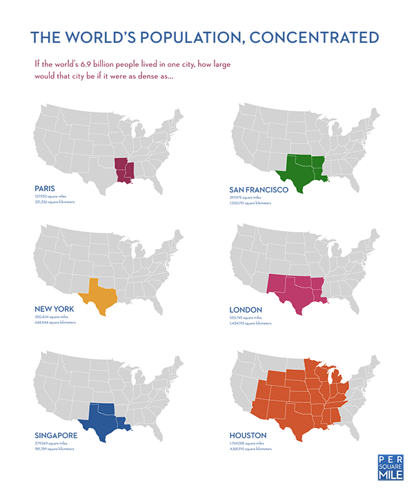
If the world was as tightly packed as New York City, everyone could fit into Texas
This fascinating infographic from Per Square Mile shows that if everyone in the world lived as close together as, say, New Yorkers, they could all fit into Texas. Which is all to say that we’ve got a lot more land than we have people. But there’s an important caveat: it takes a lot of land to support all those people. As Per Square Mile goes on to note, if everyone in the world required as much land to support them as Americans do, we would need four earths.
-
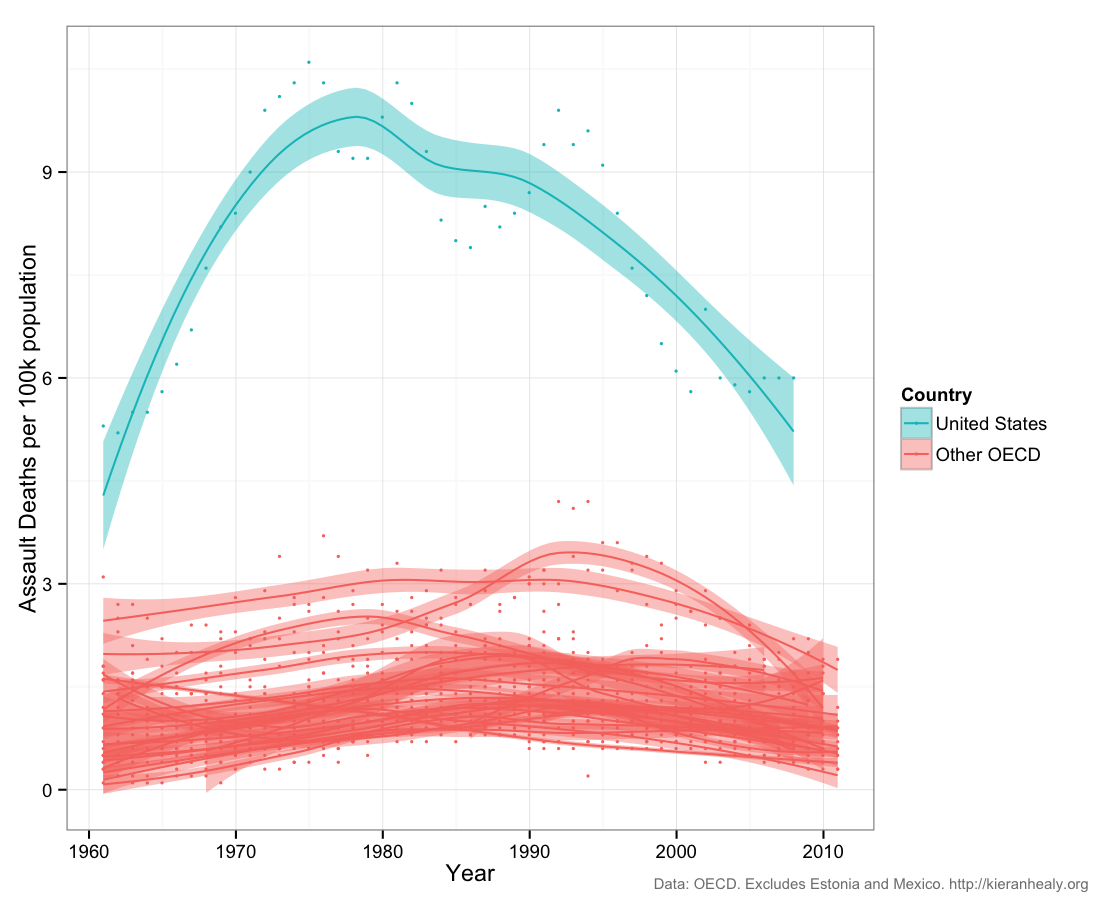
Assault deaths in America are falling
There are more gun-related deaths in America than anywhere else in the developed world. But people know that already. These are meant to be surprising maps and charts. So how about this: for all the horrible shootings in recent years, assault deaths in the Unites States have actually been falling sharply. This includes gun deaths. Michael Planty and Jennifer Truman of the Bureau of Justice Statistics found that gun homicides fell 39 percent between 1993 and 2011. (For much more on guns in America, ready Dylan Matthews’ cardstack.)
-
We've cut childhood mortality almost in half since 1990
Let’s continue with the good news for a minute. Between 1990 and 2013 the mortality rate for children under 5 was cut nearly in half. This is some of the best news in the history of the human race. "That includes an over two thirds drop in East Asia, Latin America/Caribbean, and Northern Africa, and a 48 percent drop in sub-Saharan Africa," wrote Dylan Matthews. Out of 195 countries, 191 have seen declines. There are no gains in development quite like saving a child: you haven’t only saved a life, but you’ve saved a life with many years yet to live. Still, there’s a ways yet to go: 17,000 children die every day, and the Millennium Development Goals commit us to cutting childhood mortality by two-thirds of its 1990 levels.
-
Global population will explode to 11 billion people by 2100
There were about 200 million people on earth at the turn of the first century. By the 10th Century, there were about 300 million. We didn’t hit a billion until the 19th Century. But things really sped up from there. Today there are almost 7 billion people on earth — and world population is growing quickly. The latest UN forecasts predict there will be roughly 11 billion people on earth come 2100. That’s a lot of mouths to feed, and we really don’t know how we’ll feed them.
-
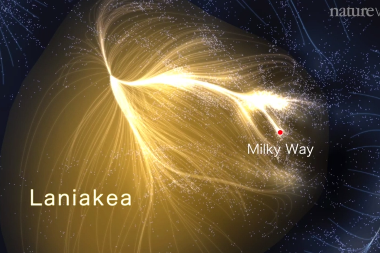
You are a tiny speck of nothingness
This is perhaps the most surprising map of all. Think about yourself for a moment. You’re a pretty big deal, right? The things that happen to you feel very consequential, don’t they? And for you, and your family, and your friends, they are. But this is a map of our corner of the universe. It’s called Laniakea and it’s got more than 100,000 galaxies and stretches more than 500 million light years across. You can’t even see earth in it, much less your city, much less your house. "It’s hard to wrap one’s head around how enormous this is," writes Brad Plumer. "Each of those points of light is an individual galaxy. Each galaxy contains millions, billlions, or even trillions of stars. Oh, and this all is just our little local corner of an even broader universe. There are many other galaxy superclusters out there." You can see more in this video from Nature. It kind of puts things in perspective, doesn’t it?
Reposted from Vox.com

More Maps and charts that will surprise you [via Nina Reznick]
A good visualization helps you see what
the data is telling you. The best visualizations help you you see things
you never thought the data would tell you. These 22 charts and maps
were, at least for me, in that category: all of them told me something I
found surprising. Some of them genuinely changed the way I think about
the world.


Subscribe to:
Post Comments (Atom)
No comments:
Post a Comment